
A finance product website focused on clarity and trust
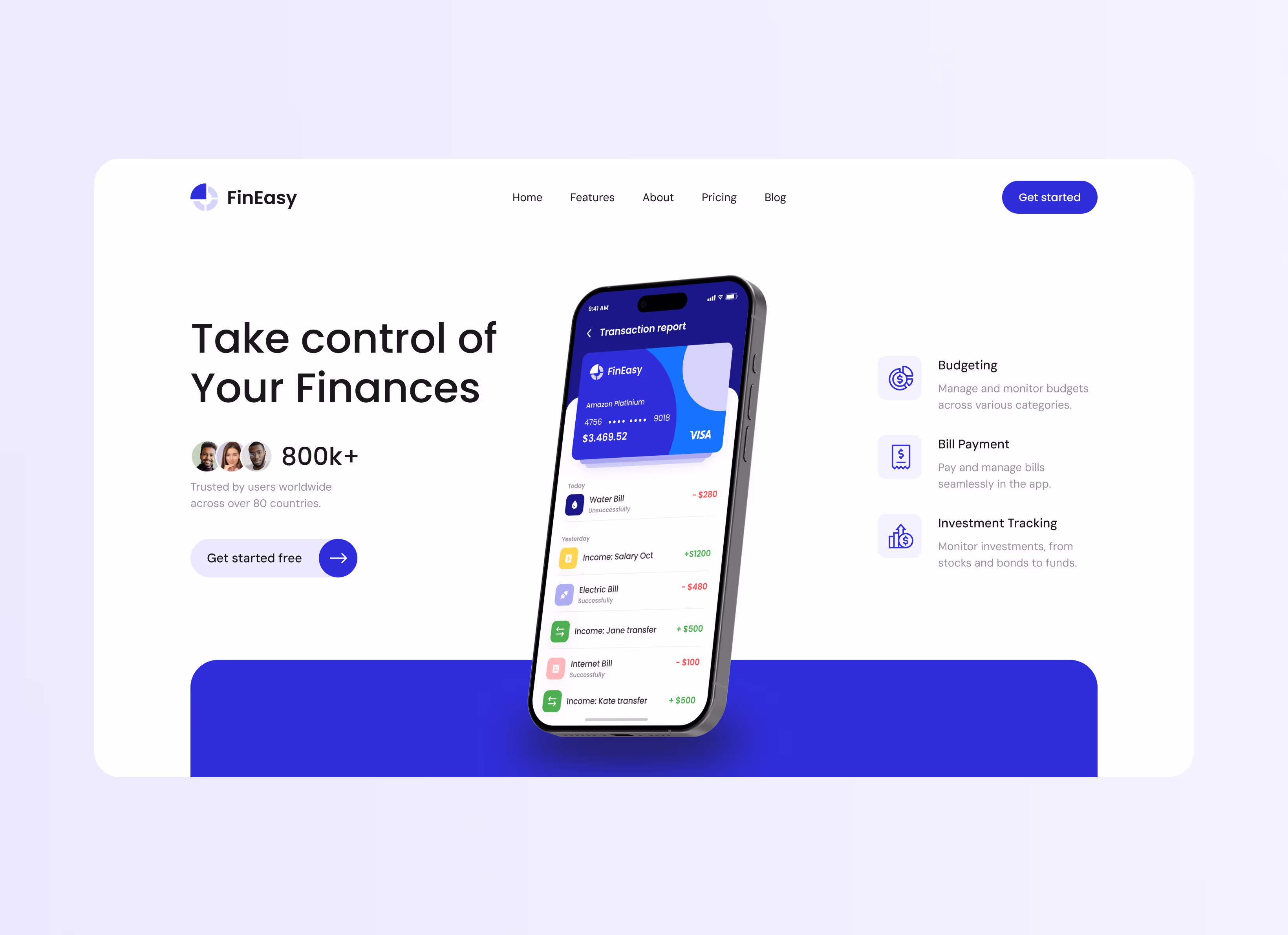
FinEasy helps individuals take control of their money through savings plans, expense tracking, investment tools, and automated bill payments. The app is built for a wide audience – from people managing daily budgets to those planning long-term financial goals. With smart automation and a clean interface, FinEasy makes personal finance accessible without demanding financial expertise.
A powerful app that needed a website to match its clarity
The website had to communicate a broad feature set – budgeting, savings, and investments – without overwhelming visitors or diluting the core message.
Financial products demand an immediate sense of trust – the design needed a clean, professional tone that made FinEasy feel credible from the first scroll.
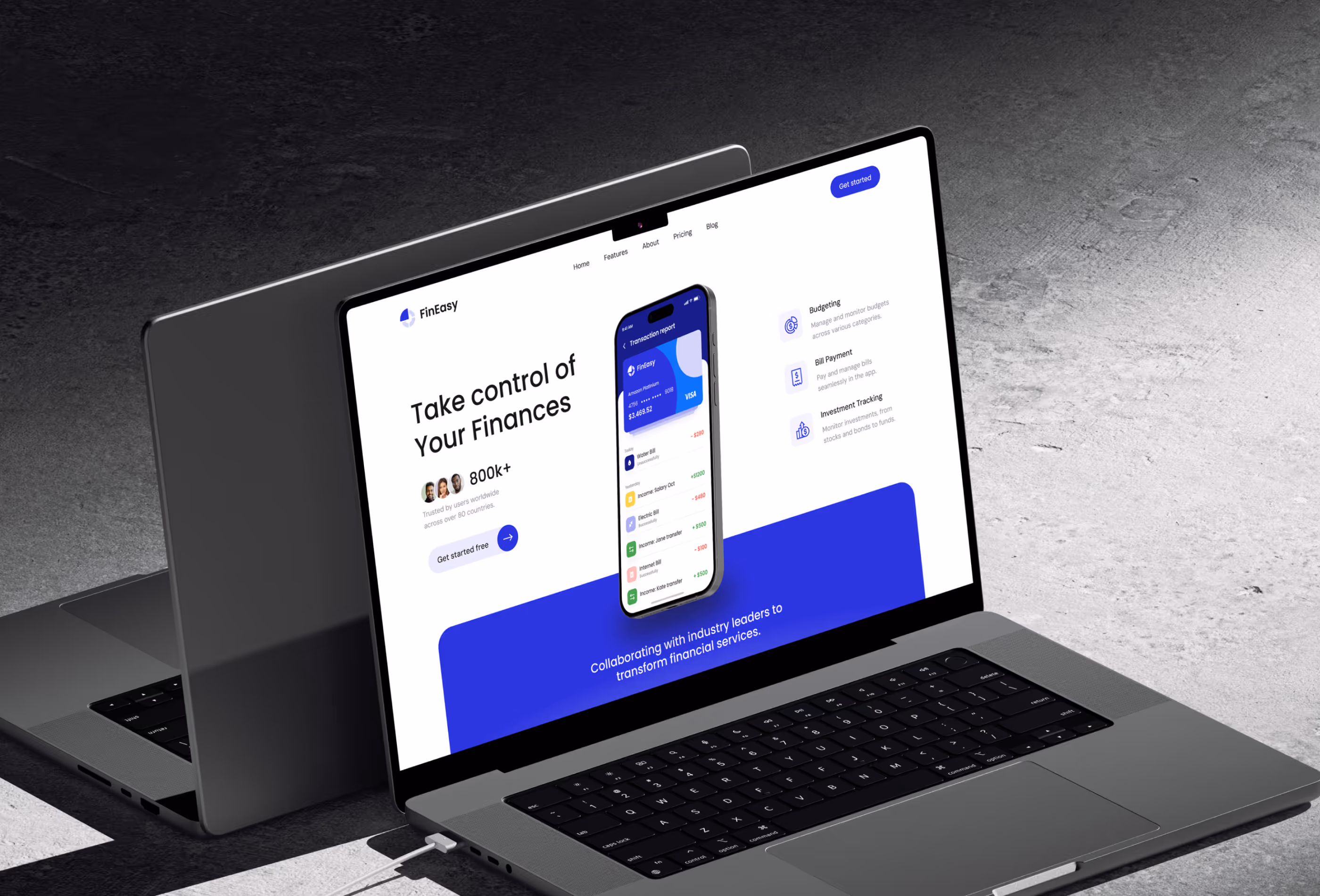
UI previews of the app had to be embedded naturally into the layout – showing how the product works without cluttering the page or slowing the experience.
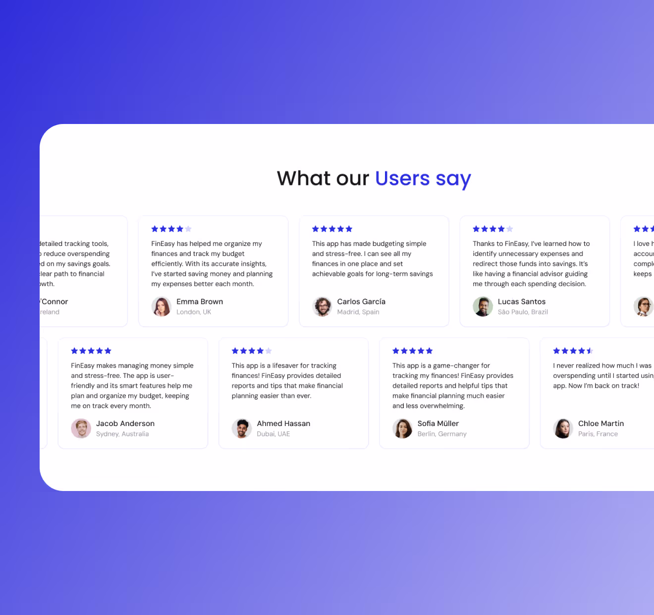
The content structure needed to guide different types of visitors – from casual budgeters to active investors – toward the same conversion point.

Discovery & goal setting

Concept & Structure

Design сreation

Fine-tuning
A website that makes you trust the app before you download it
The final design gave FinEasy a web presence that matches the product's own clarity. A structured layout guides visitors through features without friction, while embedded app previews make the value immediately tangible. The professional color palette and clean typographic system build confidence from the first scroll – making the website feel like the product's natural extension.
unique page layouts designed for different content types and user intents
UI mockups integrated directly into sections to explain product functionality
average session length on the hero and features sections combined
scroll depth reached on the first week after launch


Client’s feedback
"FinEasy finally has a website that does the product justice. The layout is clean, the app previews feel natural, and everything builds trust without feeling corporate. Exactly the balance we were looking for."