
Redesigning a SaaS landing for clarity and conversion
Girafi offers AI-driven insights, automation, and analytics to help marketers manage campaigns and scale results. The platform serves e-commerce businesses and digital agencies who need efficient, measurable tools – without the complexity that usually comes with them. With a focus on data-driven decisions and user-friendly workflows, Girafi helps teams do more with less effort.
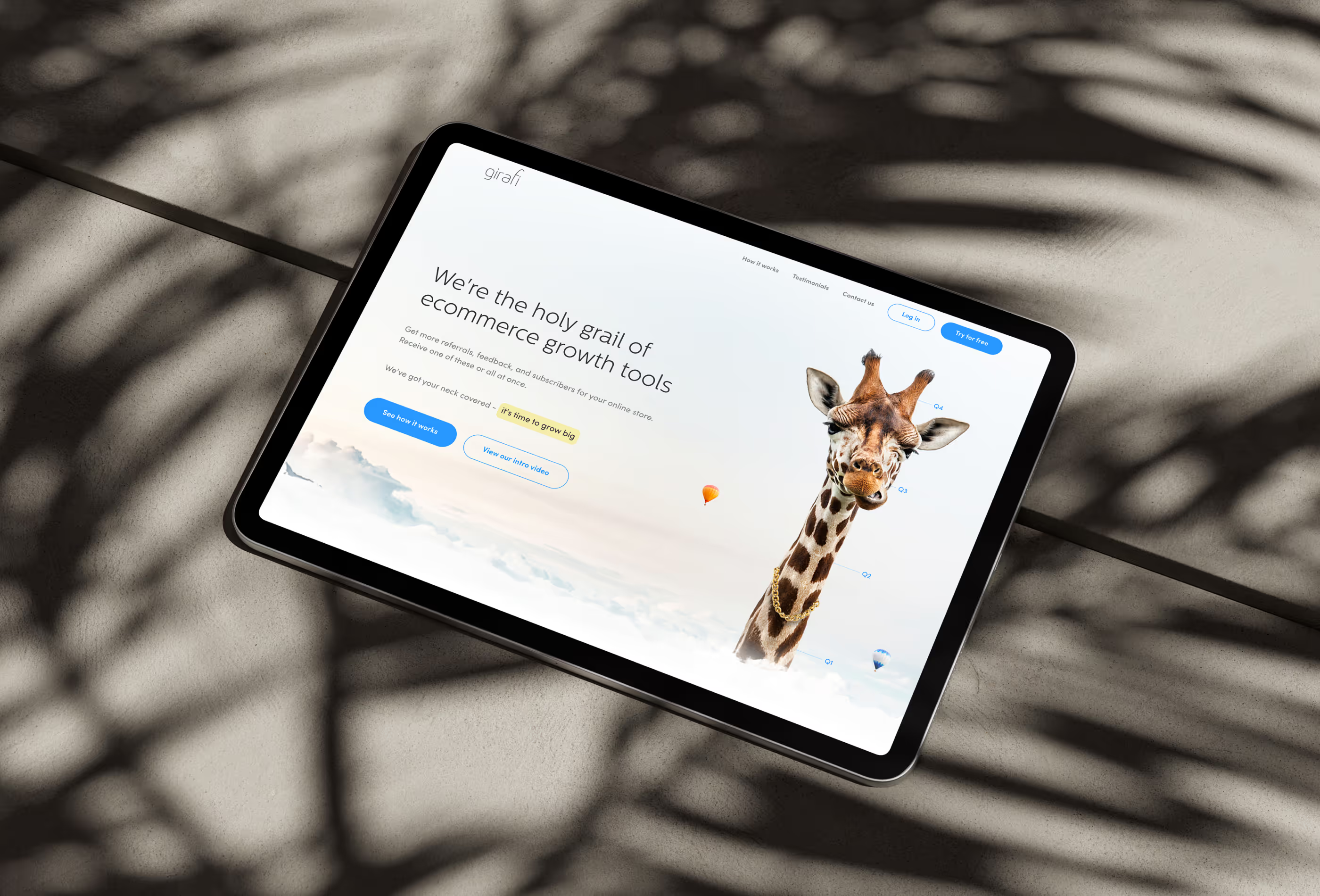
A strong product that nobody understood at first glance
The landing page failed to communicate what Girafi actually does – visitors couldn't grasp the core value quickly enough and left before taking any action.
The visual style felt outdated and generic, making the platform look like just another tool rather than an innovative, data-driven solution.
There was no consistent brand identity to make Girafi recognizable or memorable – nothing that tied the experience together visually.
The page wasn't built for conversion – CTAs lacked weight, the content hierarchy was unclear, and there was no defined path guiding users toward action.

Discovery & goal setting

Concept & Structure

Design сreation

Fine-tuning
A landing page that finally looks like the product it's selling
The redesign gave Girafi what it was missing – a clear identity, a structured conversion path, and a personality strong enough to stand out. The giraffe motif tied the entire experience together visually, while a rethought layout and sharper messaging made it easy for the right visitors to understand the value and take the next step.
screens built around a specific role in the user journey
more conversions after restructuring the layout and placing CTAs where they actually work
longer sessions thanks to a clearer content flow that kept users engaged from top to bottom
more qualified leads after sharpening the messaging to speak directly to the right audience


Client’s feedback
"The transformation of our landing page exceeded all expectations! The new design looks modern, engaging, and perfectly aligned with our brand identity. The creative use of the giraffe mascot has made Girafi much more memorable, and the improved layout significantly boosted user engagement. We’ve already noticed an increase in conversions and positive feedback from users. This redesign was exactly what we needed!"